Component Library
Avatar

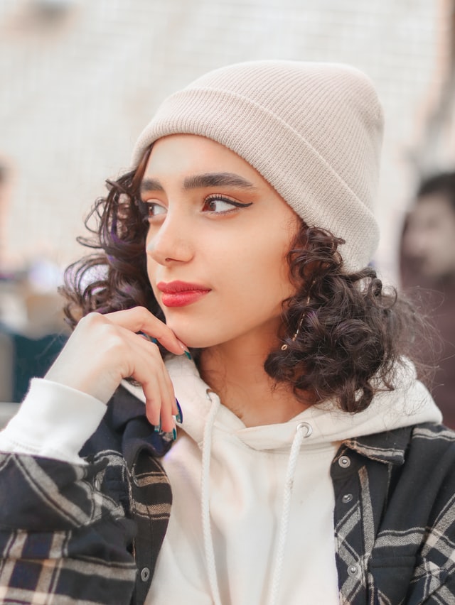
Avatar is used to represent a user or Profile picture

Default Avatar
sunset
Circular Avatar
sunset
Avatar with border
sunset sunset
Alert

Alert mainly used to inform about system/ work state is working, failed or successful

Primary Alert

done Thank You

Success Alert

done Apps Updated

Warning Alert

warning Action can not be Undone

Error Alert

error Check your network connection

Badge

A badge is used to highlight an item's state. we have different ways to represent the badge.

Badge on Icons
5
Badge on Avatars
Avatar 10
Button

Button has different styling such as Primary Button, Link, Icon and Floating action button. Class btn is base class to be used with each button.

Simple Button: use class btn
Primary Button: use class primary-btn.
Link Button: use class link-btn.
Icon with Button: use class icon-btn .
Floating Action Button: use class float-btn.
Card

Card is a Design pattern which groups the information in a flexible and quickly readable form.

Default Card
sunset-and-glass-mug

Sunset In Aurangabad

sub-heading
Visit the City of Gates, Historical Place in Maharashtra with your Family.
Card with Badge
sunset-and-glass-mug
Featured

Sunset In Aurangabad

sub-heading
Visit the City of Gates, Historical Place in Maharashtra with your Family.
Card with text Overlay
sunset-and-glass-mug

Sunset In Aurangabad

sub-heading
Visit the City of Gates, Historical Place in Maharashtra with your Family.
Text only Card

Sunset In Aurangabad

sub-heading
Visit the City of Gates, Historical Place in Maharashtra with your Family.
Horizontal Card
sunset-and-glass-mug

Sunset In Aurangabad

sub-heading
Card with Shadow
sunset-and-glass-mug

Sunset In Aurangabad

sub-heading
Visit the City of Gates, Historical Place in Maharashtra with your Family.
Image

Image is important to be responsive with which can be accessed easily

Responsive Image
sunset
Round Image
sunset
Input

Input is used to take input from user as a text and password

Textbox
Input for password
Input with Label
Error in Input
Text Utility

Text can be used in the form of headngs, small or large texts, and can be aligned in center, right, left pattern.

Headings

Heading 1

Heading 2

Heading 3

Heading 4

Heading 5
Heading 6
Text Sizes

Medium text

Small Text

Extra Small Text

Large Text

Gray Text

Grey text

Text Transform

loWERcasE tExt

UppeERcase text

Aligned Text

Center align

Right align

Left align

Lists

Lists can be of different forms

Spaced (normal lists)
  • List 1
  • List 2
  • List 3
  • List 4
Stacked (Notification Page)
  • List 1
    • List 2
    • List 3
  • List 2
  • List 3
    • List 2
    • List 3
  • List 4
Rating

Star reatings to show how good is the product / content is.

Rating (for eCommerce)
Toast

Toast componentis like an alert box that is only shown for a couple of seconds when something happens.

Toast component
Can't send photo. Retry in 5 minutes
Grid

Grids used to build layouts of all shapes and sizez

Two items in a grid
Grid Item 1
Grid Item 2
Three items
Grid Item 1
Grid Item 2
Grid Item 3
Slider

Slider allow user to make selction from a range of values. They are ideal for adjusting settings such as volume, brightness, or applying image filters.

Default slider